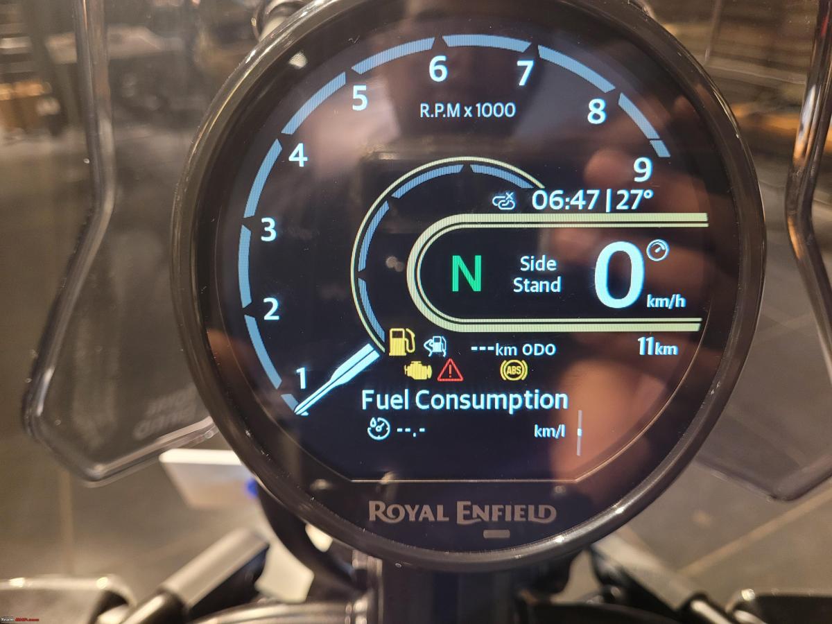
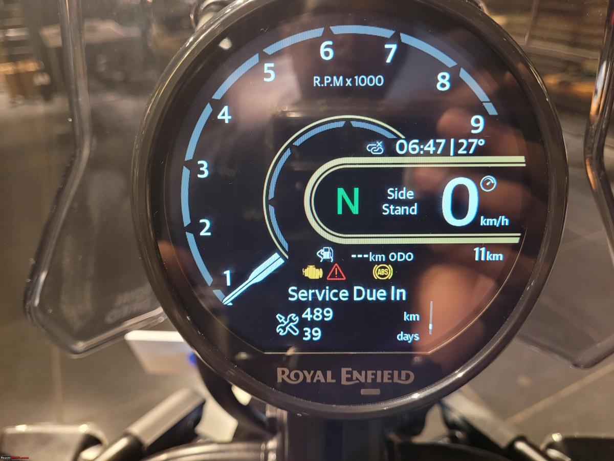
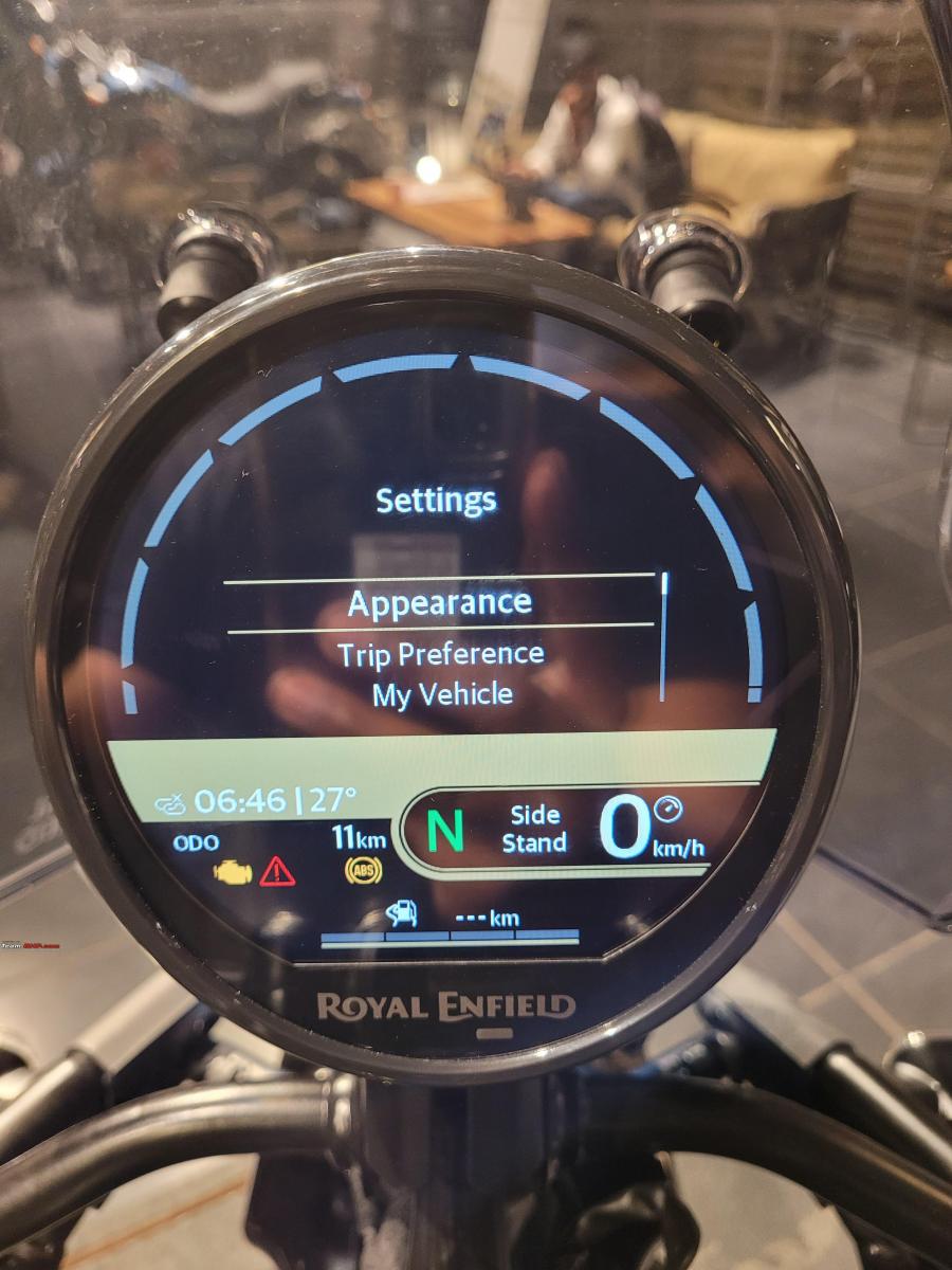
Looks and feels like it’s been built by the best Japanese engineers in the world.
BHPian neil.jericho recently shared this with other enthusiasts.
I got a few minutes to browse through the multi-layered digital dash on the Himalayan 450. Bear in mind, that I come from the Royal Enfield Continental GT 535 world where the old old school twin clocks were known to:
- Show the most basic information
- Let some condensation in, if you were in a really cold hill station and
- Lose the chrome rings surrounding them, because you know character
In comparison, this digital dash looks and feels like its been built by the best Japanese engineers in the world.


I didn’t get time to fully explore the menus but:
1. The start-up transition is very cool.
2. There are 2 home screens. You have to long press the M button on the right to switch between them. Again, the transitions are smooth.
3. In both home screens, you can then toggle through:
- Trip 1
- Trip 2
- Fuel Range (in km)
- Fuel Consumption (in km/l)
- Voltage (What a God send!)
- Service Due In (Both in Kms and Days!!) and
- Engine Temperature.
4. In addition to this, there is a detailed Settings menu as well. In this, you can toggle through and customize
- Appearance
- Trip Preference
- My Vehicle
- System
- Information
- Favourites
I need to spend at least 15 – 20 minutes to properly explore and fully wrap my head around all the available customization under the above list. I also need 15 – 20 days to wrap my head around a digital dash of this brightness, clarity and depth of settings on a Royal Enfield motorcycle!


Check out BHPian comments for more insights and information.

