Google released the Material You design language in 2021 and incorporated it in many places in Android the same year with Android 12. However, there are still a few UI elements in the operating system that don’t follow the Material You design language. One such UI element is the volume adjustment panel that comes up when you press the volume up or down buttons. Well, Google seems to be working on fixing that issue.
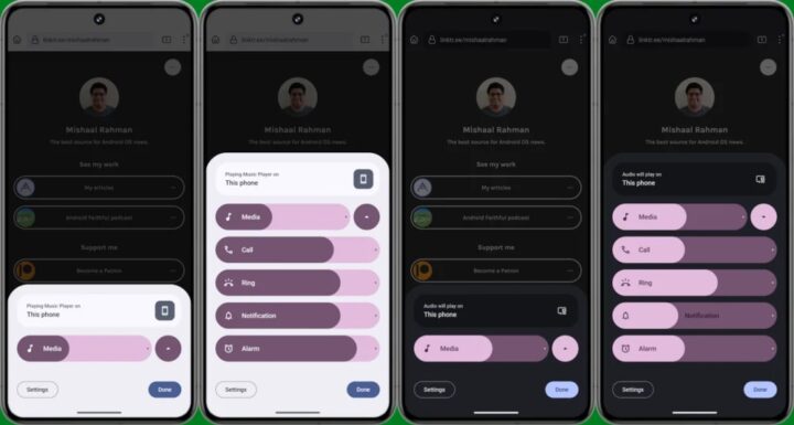
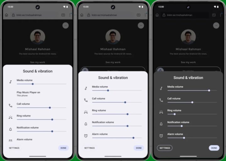
According to a new report from Mishaal Rahman on Android Authority, in Android 15 Developer Preview 2, the volume adjustment panel that comes up when you press the volume up or down button has an all-new design based on Material You. As you can see in the screenshots below, unlike the current panel which has sliders that are thin and sharp, the new panel offers sliders that are much thicker and rounder, mimicking the shape of a pill. These sliders also contain the name of the volume stream, unlike the current panel which shows the name of the volume stream above the sliders.

Mishaal says that tapping on icons inside the sliders mutes those streams, which is a new feature and allows you to quickly mute a volume stream. When you are adjusting the volume, the sliders also show the volume level, which is another new and useful feature. Lastly, unlike the current panel which shows the output device selector below the slider for media volume adjustment when media is playing, the new panel shows the output device selector at the top. It stays there irrespective if the media is playing or not.

The new volume adjustment panel has two views, a collapsed view and an expanded view. If you click the volume up or down buttons when the media is playing, the panel pops up in the collapsed view, showing you only the slider for the media volume adjustment. You can tap on the expand button next to the media volume adjustment slider to see sliders for all the volume streams. If you click the volume up or down buttons when the media isn’t playing, the panel pops up in the expanded view, showing you sliders for all the volume streams. You can tap the collapse button to collapse the panel.
Overall, the new volume adjustment panel looks much better than the current one, and the additional features it brings, offer a lot more convenience. According to Mishaal, it could show controls for spatial audio and “noise control” as well in the future. The redesigned volume adjustment panel isn’t activated by default in Android 15 DP2 and Mishaal had to do it manually. However, he suggests that Google could offer the redesigned volume adjustment panel by default starting with the first beta of Android 15.
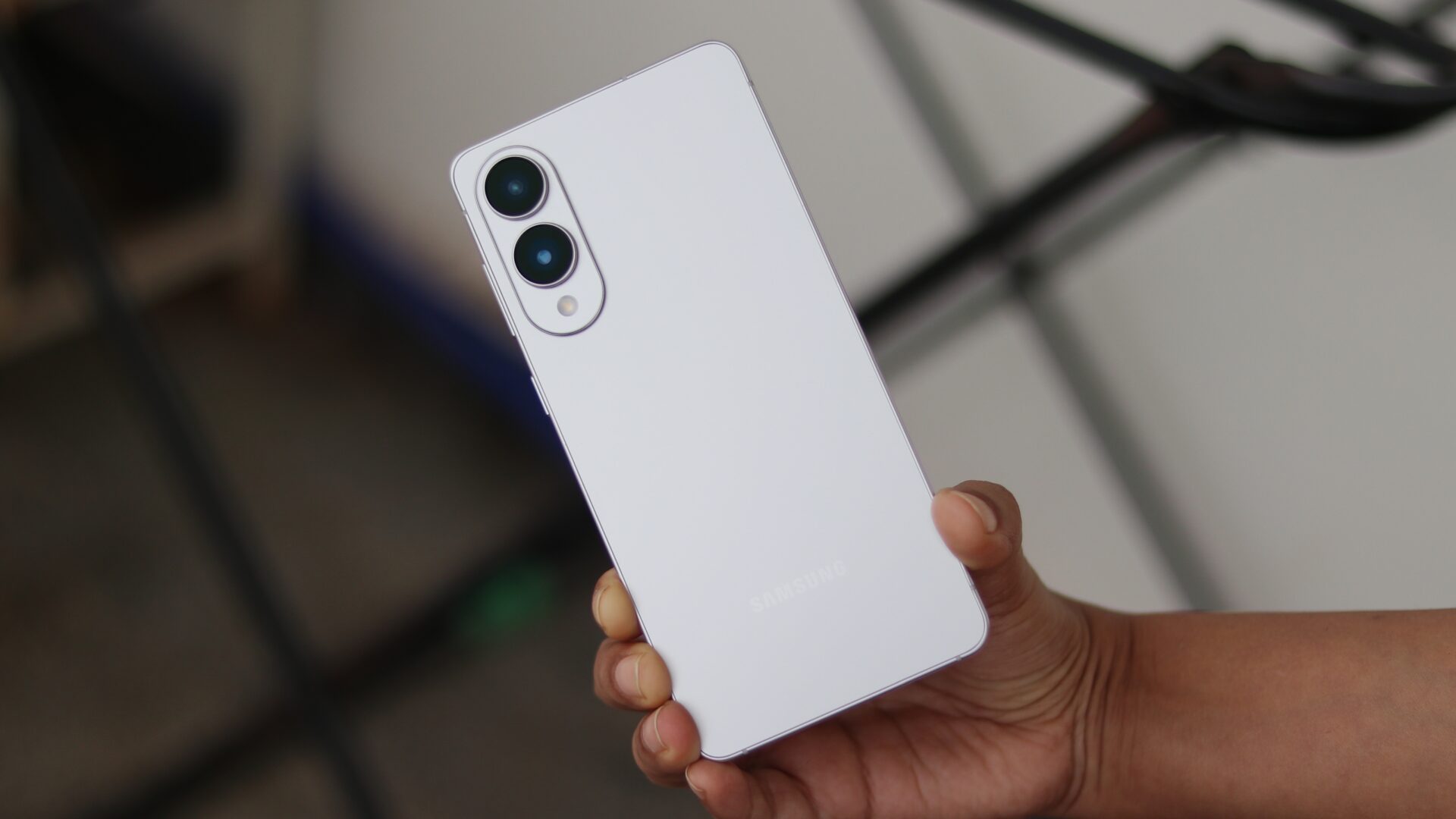
On a related note, it is worth mentioning that on Samsung smartphones and tablets, the volume adjustment panel that comes up when you press the volume up or down button has a Material You design, thanks to One UI. It looks cleaner, more sophisticated, and more modern compared to the one that stock Android or Pixel devices offer. This is one of the reasons why I love One UI over stock Android or any other custom UI.


