Apple made a pretty significant change to how you access your apps from within your text messages when it released iOS 17 last year. In previous iterations, the apps in Messages lived right at the top of your keyboard. If you wanted to quickly send money via Apple Cash or share a GIF from inside your texts, you could swipe left and right through your apps.
Then Apple changed it up with iOS 17.

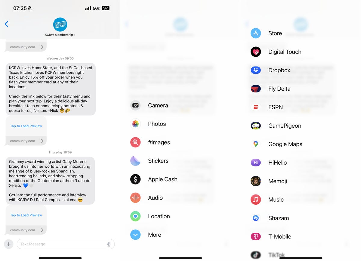
Instead of all the Messages apps living right above your keyboard on your iPhone, Apple designed a single button, to the left of the text message field, that you can tap to access a full-screen interface with with all your apps.
The new menu is big and brash and organized differently than before, and you may not be a fan of it. While we can’t do anything about the size, there is a hidden trick to organizing the menu so that your most important Messages apps are at the top of the list.
Here’s how you can swap these items around.
If you want more about hidden features on your iPhone, check out 17 hidden iOS 17 features you should definitely know about and the easy way to send photos and videos on your iPhone.
17 Hidden iOS 17 Features You Should Definitely Know About
See all photos
How to rearrange all your apps in Messages on iOS 17
If you don’t know how to access the apps in your text messages, open the Messages app, go into any text message thread and tap the plus (+) button on the bottom-left. The menu with your Messages apps will appear, with the default (Apple) apps appearing on the first page, and your downloaded (third-party) apps on the second page, which you can access by swiping up.

These are all the apps I have in Messages, organized by default on the first page and alphabetical order on the second.
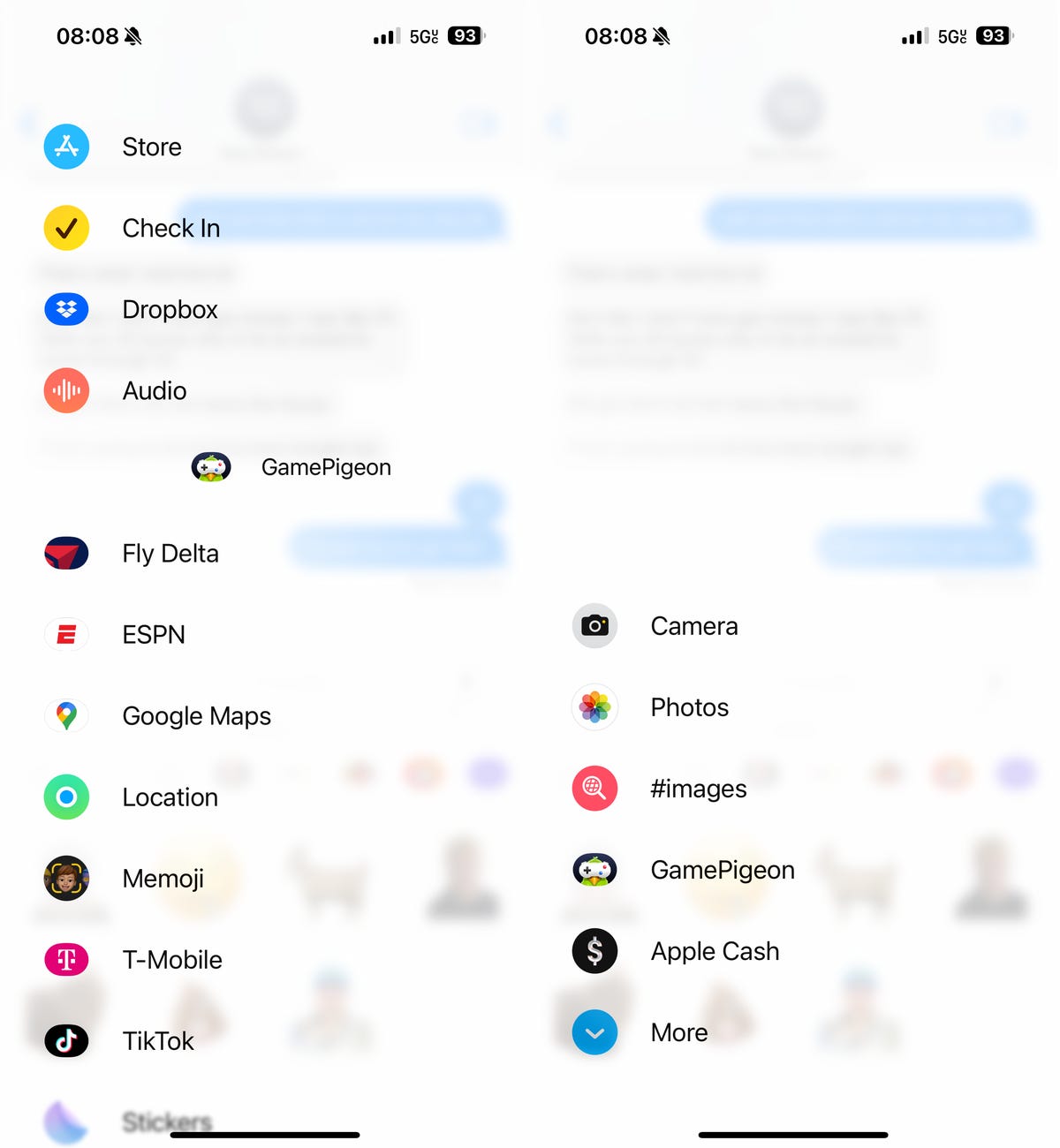
If you don’t use any of the default apps on the first page, or only use some of them, you can easily rearrange them so that you’re most important apps are at the top. To move an application, simply tap and hold down on it and drag your finger up or down the menu. This way, you can move any of the default apps from the first page to the second page, and any of your downloaded apps from the second page up to the main page.
You can fill the first page with as many apps as you want. I tested it out and was able to put every single download and default app in the first page, with none on the second page. However, I prefer to keep only a handful of my most used apps on the first page, and everything else in the second.

Just press and hold to move your apps around.
Now I don’t have to scroll through all the apps to quickly find what I need.
For more, here’s how you can fix the most annoying iOS 17 features and settings.


