Last updated: August 23rd, 2024 at 14:33 UTC+02:00
As you may have probably heard several times before, the upcoming One UI 7.0 update will change many things about the look and feel of Samsung’s proprietary Android skin. But oddly enough, in my eyes, one of the most significant changes One UI 7.0 is supposed to bring is rather inconspicuous.
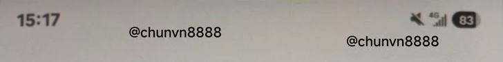
If some of the One UI 7.0 leaked screenshots are accurate, Samsung intends to completely redesign the battery indicator in the status bar. As shown in the screenshot below, the upcoming UI update will supposedly replace the current status bar battery indicator with a pill-shaped one.
It doesn’t look like much, but this redesign you could call banal at a glance is bigger than you might think unless you start digging down into the history of One UI and TouchWiz.
The battery indicator has been about the same for a decade
As far as I can tell, the way the status bar battery indicator looks hasn’t changed much since the release of TouchWiz Nature UI 3.0 and the Galaxy S5 in 2014.
For the past ten years, we’ve had roughly the same single-color, battery-shaped, vertically-aligned icon with a thunder logo on top whenever the phone is charging. Even before TouchWiz Nature UI 3.0 went live in 2014, the battery status indicator looked roughly the same, save for the fact that it was multi-color and had a green interior with a white outline.
Very minor modifications appear to have happened over the past decade. The corners of the battery indicator have become slightly rounder, but that’s about it.
The story continues after the video
I am aware that going from a tried-and-tested design to the new pill-shaped status bar indicator won’t make a huge difference to the user experience. Some people might not even like the change because change is sometimes hard to adapt to.
But to me, this is one of the most intriguing redesigns precisely because the battery status icon hasn’t been updated in so long. It kind of lends more weight to the idea that Samsung might be going the extra mile with the One UI 7.0 update, just as some rumors predicted. And it looks impactful because of its history. At least, to my eyes, it does.
Maybe I like what I see more than I probably should. Either way, I’m looking forward to One UI 7.0, and I hope Samsung will release the first beta update soon. The company hasn’t confirmed a date, but rumors say the beta program might be released in September.