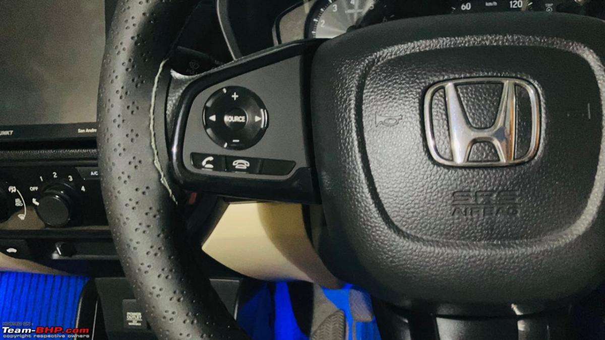
Just audio & phone controls for me. I never use cruise control, and the MID toggle is too infrequent to warrant a place on the steering wheel.
BHPian Aditya recently shared this with other enthusiasts.
For a while now, multifunction steering wheels have been available in cars – even those in the lower segments. These are normally located on the left and right spokes of the steering and make it easy for the driver to control the infotainment system, set the instrument cluster / MID to his liking and more.
With every passing year, cars are being equipped with new features. As a result, car manufacturers are trying to squeeze in many more controls on the steering wheel. We see buttons for telephony, driving modes, cruise control, ADAS and more. This causes steering wheels to appear cluttered. Too many buttons also means that you may not find the correct button for a function. As an example, you might end changing the radio station instead of adjusting the volume. Touch-type control can make things worse. Further, as you rotate the wheel, you might operate a function unintentionally.
The Mercedes GLC SUV I drove last year had extremely cluttered steering wheel spokes. Controls for the MID, infotainment, telephony, cruise control and more were crammed in. All controls were touch-type, which made matters worse: 
If you ask me, there are too many buttons on the spokes of the steering wheels of some cars. Many are not required to be used on a regular basis. Some might not be used by the owners for many months or years together.
The Hyundai Ioniq 5’s steering wheel has multiple touch-type switches and 4 toggle switches! 
One can scan through the MID, the infotainment, telephony and ADAS features:
Thankfully the drive mode selector switch has been placed below:
However, some controls are almost necessary to have on the wheel. These controls may depend on the users’ driving patterns and personal choice. In my opinion, only the controls for the features we use every day should be on the spokes of the steering wheel. These include the infotainment, telephony and MID. Other controls should be placed elsewhere.
Among all cars, I have liked how Ford placed switches on the steering wheel of the 2018 Ecosport:
The left spoke houses the buttons to toggle between the MID’s features, while buttons for the audio controls, voice commands and telephone are located on the right spoke. A mute button was missed though:
Buttons for the not-so-regularly used cruise control feature were placed lower on the steering:
So, what are the control you feel are must-haves on the spokes of the steering wheel of your car?
Here’s what GTO had to say on the matter:
Just audio & phone controls for me. I never use cruise control, and the MID toggle is too infrequent to warrant a placement on the steering wheel.
This is all I need:
Here’s what BHPian Jeroen had to say on the matter:
Of course, I still own cars with no buttons on the steering wheel, apart from the horn! eg the Mercedes W123 and Alfa Romeo Spider.
But I do have had cars with buttons on the steering wheel. As Aditya mentions I only need the functions I use constantly on the Steering wheel.
In order of importance I prefer;
- Cruise Control, set, speed up/down/re-engage
- Phone pick up, volume and disconnect
- Sound system, volume and station and or song selection/forward
That’s about it. I like very busy dashboards with lots of switches and stalks, handles and so on. But a few essentials must be on the steering wheel. The rest I’ll handle “off steering wheel”, so to speak
Here’s what BHPian G-One had to say on the matter:
I have ordered a refurbished MOMO for my Pajero V33 Classic 3.0 V6. Exquisite feeling of wood, a bit of leather and a touch of horn. Just what i love.
Here’s what BHPian Miel had to say on the matter:
Which is India’s current “National Steering Wheel” ???
– That was the topic of discussion among me and my pals last afternoon at a local chai point.
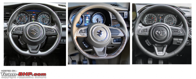
I, for one, love the flat-bottom with thumb-contours steering wheel of my XL6 and the Swift. And it turns out that this steering wheel layout, with same control layout and configurations, is India’s “top selling” (kinda) steering wheel. Get this – across the Swift, Ertiga, Baleno, Dzire, Brezza, Fronx, Grand Vitara, XL6, Rumion, Hyryder, and Glanza – this unit got into the hands of a whopping 1.10 Lakh new car owners last month alone!
It has 2 versions. One is the the flat-bottom with thumb-contours version on all, except the Brezza, Grand Vitara/Hyryder, and Jimny. The latter cars get the non-flat-bottom, non-thumb-contours version. The controls layout are the same across both.
I love everything about it, except the painful fact that the horn pad is only in the center and I can’t simply reach with my thumb to honk. Have to resort to wrist-forearm acrobatics or dedicatedly depute a palm to honk. Though many dislike this dated design, for me simple stuff like having the telephony controls off the face of the steering, but just below on a ledge, ensure I don’t accidentally press call in heavy traffic turns.
Here’s what BHPian JoshMachine had to say on the matter:
I prefer the steering wheel spokes to house only the most essential items be it the telephony/call, MID/radio toggle, volume controls.
And my A4 has exactly the same, simple yet very functional setup:-
On the left, there are buttons for scrolling the MID left to right and a general ‘view’ button. There’s also the ‘list’ button which doesn’t do anything, atleast on my Premium Plus. On the right, there’s the ‘*’ button for toggling between media and FM radio + button for invoking mobile call log + onboard voice ‘Hey Audi’ + song/playlist left & right button.
The scroller also doubles up as a important ‘mute’ button, even muting the Radio.
Check out BHPian comments for more insights and information.


