Last updated: November 26th, 2024 at 13:39 UTC+01:00
Samsung’s Galaxy Wearable mobile app got a new coat of paint recently, reflecting the company’s efforts to streamline the smartwatch software experience.
Some things have changed drastically, while other elements are only mildly refreshed. Here are the main takeaways.
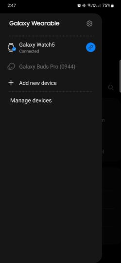
- The hamburger menu, which listed all the connected wearable Galaxy devices, has been removed.
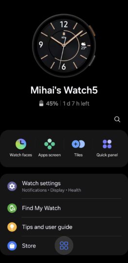
- There’s a new button at the bottom of the screen that hides the list of connected devices.
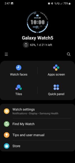
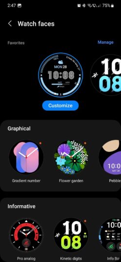
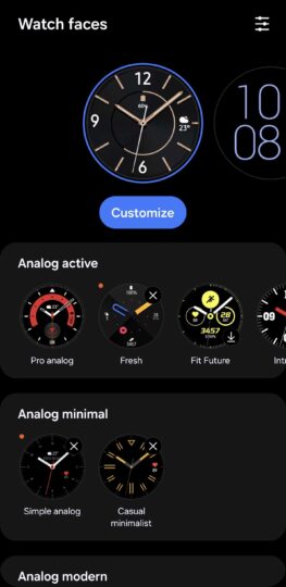
(Left screenshots are from old version / Right screenshots are from new version)
- The home screen has been refreshed. The Watch preview at the top of the home screen is larger and has more attention to detail. It now shows the button layout of whichever model you have.
- Furthermore, the “Watch faces,” “Apps screen,” “Tiles,” and “Quick panel” buttons are rearranged and recolored. Similarly, the other icons on the home page have been slightly recolored.
- Finally, the Watch Faces menu has also been slightly revamped. The “Manage” text is replaced by a button, the background for each watch face category is a darker shade of gray, and watch faces are now listed in more categories.
The “App screen,” “Tiles,” and “Quick Panel” screens are virtually unchanged. It almost feels like Samsung ran out of time to redesign everything.
For example, the Tiles screen still has the “Manage” text instead of using the new button like the Watch Faces menu.
It is possible that Samsung will refresh these other facets of the Wearable app later and give the UI a second coat of new paint. We’ll let you know if any future updates continue to streamline the rest of the UI using these new design ideas as a foundation.

