The hamburger button has been a shortcut to list-type menus in different operating systems and software applications since the ’80s (via Wikipedia). Decades later, Android OS adopted the idea of the hamburger menu as a solution to UI design hurdles posed by small screens. And even today, many Android apps, including Samsung first-party apps, use it.
Frankly, the hamburger menu can be a practical solution to a UI challenge, but at times, it does feel outdated. In Samsung’s case, it feels inconsistent, too, which is why I hope the company will address it through One UI 7.0 and subsequent updates.
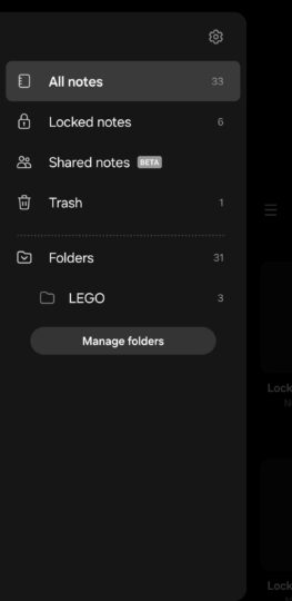
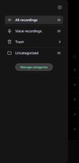
In some Samsung apps, users will find the hamburger button on the left side of the screen. When pressed, it slides out a list that doesn’t cover the entire screen but offers a handful of options, including a shortcut to the app’s general settings.
As of this writing, some of these apps are Contacts, Calendar, Samsung Notes, Voice Recorder, Email, and Weather.
Here are a couple of examples of what the classic hamburger menu looks like.
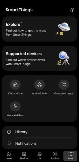
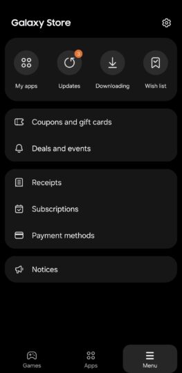
In other Samsung apps, such as Galaxy Store, SmartThings, and Samsung Internetthe hamburger menu is located in the lower-right corner of the UI. And when pressed, it usually opens a full-screen menu.
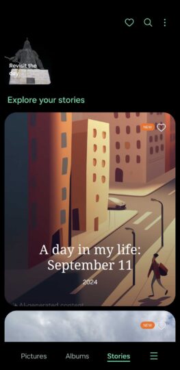
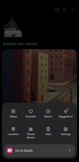
Except when it doesn’t. The Gallery app’s menu button opens a relatively small menu from the bottom of the screen. It’s quite unusual.
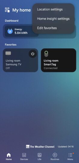
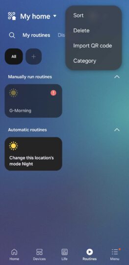
Lastly, most Samsung apps have a three-dot button that hides a highly unpredictable pop-up menu. You’ll never know what you’re going to get by pressing this button, and results often differ even within the same app based on which screen you’re viewing.
Here are two examples from the SmartThings app, showing the contents of the pop-up menu when accessed via the Home and Routine tabs.
By now, you probably know where I’m going with this. Samsung’s app design is as unpredictable as it can be and highly inconsistent when it comes to hamburger, settings, and three-dot menus. You never really know what hides behind one of these buttons.
Don’t get me wrong. I wouldn’t like every Samsung app to look the same. I understand that some apps have needs that others do not. But I wish things were a bit more consistent and that Samsung apps could feel like they were developed by the same people or at least different teams that follow the same design principles more closely.
I suppose it’s not a big issue once you get used to them. And it took the recent update to the Wearable app to remind me that these inconsistencies even exist. The recent Wearable app update removed the hamburger button and menu, and perhaps it shows the direction Samsung is taking.
Samsung is on a quest to redesign its One UI proprietary skin for Android. One UI 7.0 and subsequent firmware updates could very well get us closer to a more consistent feel and look across all Samsung apps.
In recent years, Google also ditched the hamburger button in some of its apps, such as the Play Store, Photos, and Messages. Maybe it’s time for Samsung to continue doing the same.

