Last updated: February 18th, 2025 at 15:57 UTC+01:00
The Gmail app for Android looks great. However, it doesn’t mean that there’s no room for improvement. Google consistently tries to make it look better, and in its latest attempt to do so, the company has added icons to the options that you see when you click on the three-dot menu in an email, as well as, arranged those options in sections.
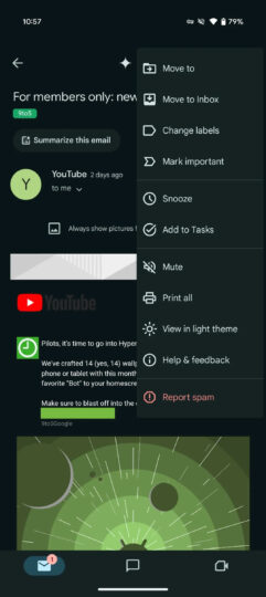
As spotted by 9To5Googlein the latest version of the Gmail app for Android (version 2025.01.25.721794537), when you open an email and click on the three-dot menu at the top-right corner of the screen, you will see icons before the options, which weren’t present previously. Plus, the options are now arranged in four sections.
Old Design
New Design
In the first section, there are four options: Move to, Move to inbox, Change labels, and Mark important. In the second section, you will see two options: Snooze and Add to Tasks. In the third section, you will find four options: Mute, Print all, View in light theme, and Help & feedback. In the fourth section, there’s only one option, Report Spam.
These changes not only make the menu look better but also make it easier to find what you are looking for. The publication says that Google is rolling out the new UI widely globally. However, despite having the latest version of the Gmail app on our Galaxy S23 in India, we aren’t seeing the changes. It suggests that Google is rolling it out in phases.