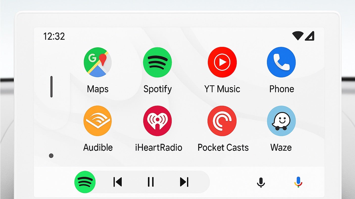
AI-generated concept of a light-themed Android Auto UI. | Image credit: Google (original unedited image)
The main problem with those early versions spotted last year was inconsistency. While parts like the bottom navigation bar and suggestion cards switched to lighter colors, crucial elements like the settings menu, media apps, the phone screen, and navigation apps stayed dark. This made the whole look feel disjointed and incomplete, not like a proper theme. It just didn’t look right.
Fast-forward to now, and insights from newer versions of the app’s code suggest Google has ironed out many of those kinks. The light theme isn’t just partially applied anymore; it seems to stretch consistently across the entire Android Auto experience.
So, why bother with a light theme when dark mode is popular for being easy on the eyes, especially at night? Well, a light theme has some real pluses, particularly for daytime driving. If you’ve ever struggled to see your car’s screen clearly with bright sunlight flooding in, a light background with dark text can offer much better contrast and visibility compared to a dark screen.
It’s definitely encouraging to see the light theme evolve from a patchy experiment into something that looks genuinely usable and integrated. While we need to remember this is all based on hidden code and isn’t officially out yet, the progress is a positive sign. Having the option to switch to a light interface would make Android Auto more versatile, especially for improving that tricky daytime visibility. Hopefully, this user choice becomes available for everyone before too long.


